
2017 | Poster Design | 1 Week
PLAYING WITH FUTURA
As a part of a college course in NID, each student in our batch of fourteen in Exhibition and Spatial Design was given a typeface to study and research upon. The intent behind this exercise was to familiarise ourselves with the various aspects of type design, and how the smallest of characteristics can change the whole look and feel of a typeface. Keeping these concepts in mind, I was given Futura, designed by Paul Renner to study and play around with for a week.

First, to get comfortable with the letterforms and understand all its different nuances, each of us created various compositions using letters from our respective typefaces. The compositions didn’t necessarily have to make sense, they just had to look good and give a hint of what typeface we were using. This was done as a warm-up exercise to our final assignment—creating a poster using elements of the given typeface.


A closer look at the tiles
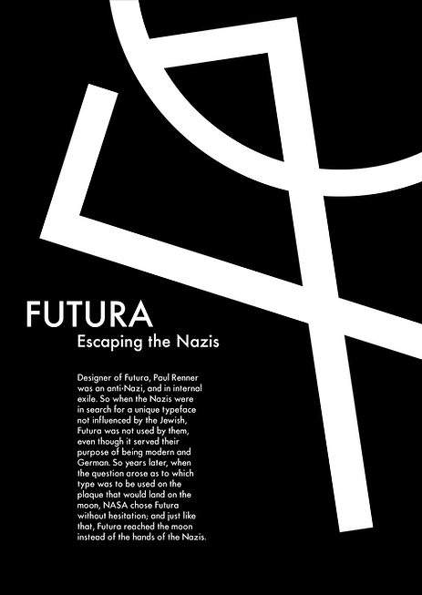
While we were all were busy making our abstract compositions, we also had to do some basic research on our typeface. The information we gathered during this research phase would be used in our final poster. Futura’s history is quite intriguing, and it was hard to fit all that material into one poster, so I decided to focus on a part of it. Initially, I chose to depict the story of how Futura was picked to be the typeface that NASA would use on its Lunar Plaque that was being sent to the moon in 1969 as this was an historic moment for all of mankind. I was not happy with any of the resulting posters, and chose to change my story. Eventually, I decided to focus on the story of how Futura narrowly escaped becoming the Nazis’ trademark typeface for all their correspondence. The letterforms of Futura beautifully fit the theme of how it steered clear of becoming an infamous typeface.
The final poster